Populating Content
The content for posts and pages goes into these 3 fields:
- Header region
- Main region
- Side region

Content on a page is broken down into sections.
And sections comprise of blocks (also referred to as components within Strapi).
Let's go over the various content blocks that with which you can use to build a page.
When you click on the "Add a component to Header/Main/Side region" (pill-shaped) button inside of a region field, you are presented with just one option—a section block.
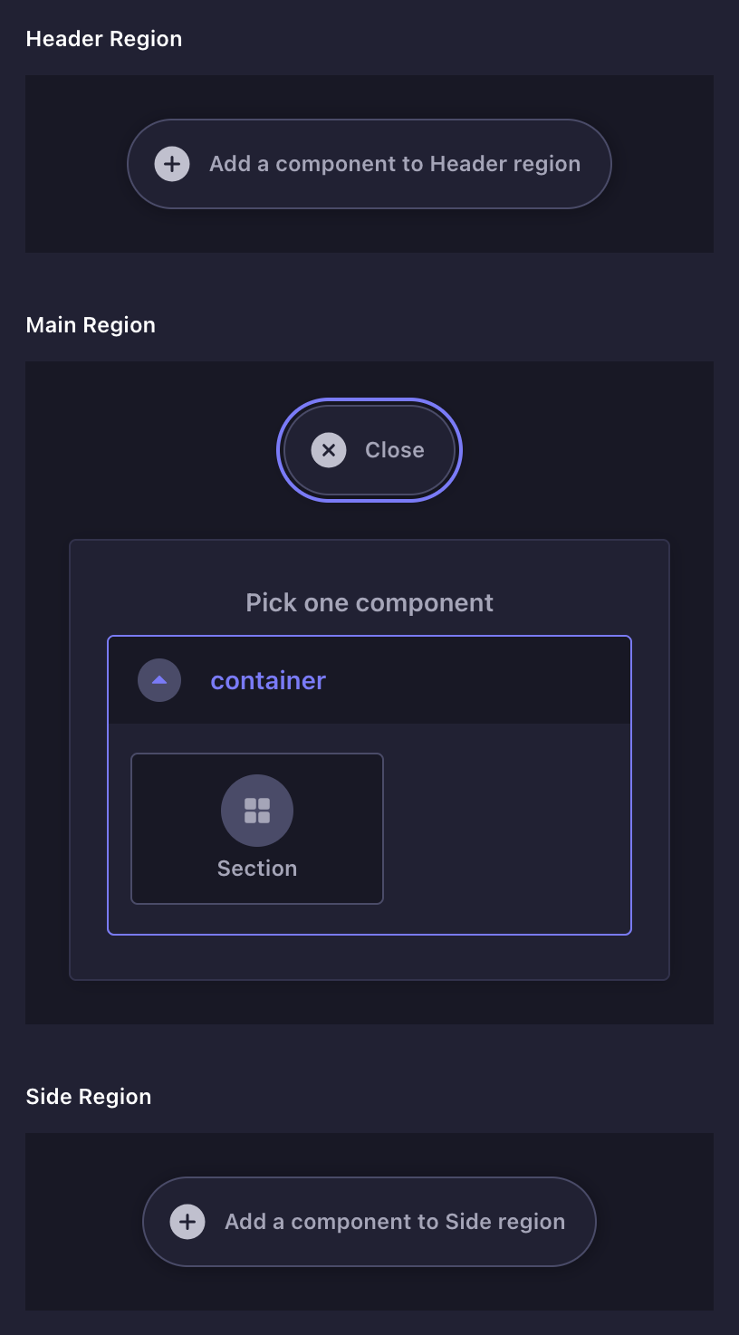
Section block
A section block comprises of a heading and content. Its fields include:
- Title
- Show on "Table of Contents"
- Heading
- Collapsible
- Collapsed by default?
- Content
Title
This field does two things:
- Sets the name for the section on the Table of Contents section of the page (on the frontend)
- Makes the section identifiable (on the Strapi edit screen)


Show on "Table of Contents"
This determines if the section will be listed on the page's table of contents.
Collapsible
This determines if the section can be collapsed.
The Collapsed by default? field determines if the section is already collapsed to begin with, on accessing the page.
")
Content
This field is expanded on clicking the "Add a component to Section" (pill-shaped) button.

There are a dozen blocks to choose from, organized by category:
| Category | Fields |
|---|---|
| Text |
|
| Media |
|
| Navigation |
|
| GDL |
|
Heading block
Headings introduce new sections and organize content to help users understand the structure of a page.


| Field | |
|---|---|
| Level | Determines how big the heading is |
| Font Family | You can choose between two fonts — sans-serif and monospace |
| Line 1 Line 2 | Headings on the GDL site can be set on two distinct lines. Line 1 is rendered in the primary color, while Line 2 in the secondary color. |
| Link | This will add a button link that is placed to the right of the heading |
WYSIWYG block
This has a close resemblance to what you'd see when working with Microsoft Word or Google Docs, albeit a limited sub-set of those.


| Field | |
|---|---|
| Layout | Determines if the content should the span the entire width of the content area (full-width) or just a narrow column (normal) |
| Content | A wide variety of content can be expressed here — regular text, headings, lists, images and quotes |
To format sub-sets of text in monospace, the inline code </> formatting option can be leveraged.
Quotes
To add a quote, simply select the Quote formatting option (pictured above).
Images
The WYSIWYG block supports adding images. However, you do not get to control its aspect ratio. For that, there is a dedicated image block (covered next).
Image block
This one's for inserting an image.


| Field | |
|---|---|
| Image File | Takes you to the media library where you can upload an image or select among previously uploaded ones |
| Aspect Ratio | You can choose either of the following:
|
Media Library
This is a place where you can organize your media files. It is similar to using Finder (on MacOS) and Explorer (on Windows). You can:
- Upload images
- Edit image meta-data
- Create folder structures and organize images in them
- Delete images
Captions
To add an caption, click the edit icon (a pencil) on the image tile. Then add the caption under the "Caption" field.


Gallery block
This is for displaying panels of images.


The block is comprised of rows, each of which are comprised of images. A row can have either 1, 2 or 3 images.
Using the gallery first involves adding rows, then images to the rows. Rows come in 3 versions:
- 1-image set: for rows with just 1 image
- 2-image set: for rows with 2 images
- 3-image set: for rows with 3 images
A gallery can have multiple rows, each with a different number of images. Each row has the following fields:
| Field | |
|---|---|
| Layout | Determines the relative widths of the images in the row (whether the images should be equal in width, or one image should be wider than the other) |
| Images | Takes you to the media library where you can upload images or select from previously uploaded ones |
Button link block
Adds a button-shaped link.


| Field | |
|---|---|
| Label | The text that the button will have |
| URL | The link that the button will navigate the user to |
Image link block
Similar to the button link block. However, here the link wraps over an image instead of a button.


| Field | |
|---|---|
Image | Contains the following sub-fields:
These are identical to what you find on the image block. |
| Link | The link that the button will navigate the user to |
Heading + Content block
A 2-column block — the left column holds the heading, while the right column holds the content.


| Field | |
|---|---|
| Heading | Text that describes the content to the right |
| Content | A wide variety of content can be expressed here — regular text, headings, lists, images and quotes |
Image + Content block
A 2-column block, with an image on one column and content on the other.
Comes in two variants — a single instance variant and a list variant


| Field | |
|---|---|
Image | Contains the following sub-fields:
These are identical to what you find on the image block. |
| Content | A wide variety of content can be expressed here — regular text, headings, lists, images and quotes |
| Layout | (only on the list variant) Determines whether to place the image on the left or the right column. The content will go to the column opposite the image. |
Promo block
Used to promote (or cross-promote) a piece of content.
It can be the first thing users see at the top of the page, or it can serve as a (promotional) interruption from the main content.


| Field | |
|---|---|
| Heading | |
| Image | This will go to the background |
| Content | |
| Link | A button link (identical to the button link block) |
Post Listing block
A list of tiles, where each tile represents a post (but it can represent anything really).


| Field | |
|---|---|
| Layout | Posts can be laid out in either 2 or 3 columns |
| Feature First Post | If toggled, the first post will span the entire width of the main content area |
| Content | A list of posts |
| ├── Image | The image that represents the post |
| ├── Hover Effect | An animation that plays when the post tile is hovered over. There are 4 effects — dog-ears, cylinder, octagon, hourglass |
| ├── Open in New Tab | Whether to open the link in a new tab or not |
| ├── Link | URL of the post |
| └── Content | A wide variety of content can be expressed here — regular text, headings, lists, images and quotes |
Fellowship block
A table that lists all the projects that are part of a fellowship program.


| Field | |
|---|---|
| Name | This could also just be the year when the fellowship programme took place. |
| Projects | Contains a list of projects |
| Project | |
| ├── Title | A label to refer to the project within the Strapi form, especially when the project is collapsed |
| ├── Cover | An image showcasing the project or the fellows or both |
| ├── Description | An account of the project |
| ├── Fellows | A list of the fellows involved — their name and role/designation |
| └── Link | For linking to another post with more information about the fellowship project (identical to the button link block) |